Why Modern Warfare 2’s Presentation Is Awesome
Call of Duty: Modern Warfare 2 is one of the most successful video game launch titles to date. With consumers, it’s a love/hate relationship because some people feel that they were ripped off by not getting a public beta. What they got was, a game with a short single player, a nice co-op, and an incredible multiplayer that was filled with glitches that many people took advantage of. With all that aside, millions of people log on and play the game each day. That includes me and the crew that I roll with, but this article isn’t about that. What I want to focus on is the presentation and graphic design implemented into MW2.

My first impression when I finally got my pre-order of MW2 felt like a little geek moment. The rendering on the package (even though it resembled what the last cover looked like) got me excited. Besides the fact that I like yellow hues, I wanted to be one of the first to play online and own some people.

I was a little disappointed when I saw that there was little design elements put into the booklet however. It had me worried for a second until I put the disc in and the game finally started up on my PS3.

I thought they were going to go overboard on the presentation with a minimalist approach. What I found was a mixture of minimalist and awesomeness.
I’ll start with the font usage. I noticed that two main fonts were used, Bank Gothic Medium and ITC Conduit Regular. The fonts go so well together and are used throughout the games entirety with good execution.

These two fonts help the game to feel very modern and somewhat military friendly. I’ve seen horrible font usage in games like F.E.A.R. and Iron Man. Not so much in the logos, but in the aesthetics of the games themselves.  ITC Conduit is a very legible font that helps the reader’s eye flow through the information very easily. Not to mention that it looks beautiful hovering over the gorgeous graphics within the game itself.


From the moment you get a nice kill or a clean head shot in the multiplayer portion of the game, the fonts animates in an arcade fashion giving the player a rush of satisfaction because they just pulled off a kill streak that got them a Harrier Jet, Chopper Gunner, or a Tactical Nuke, among other things.


When it comes to a minimalist approach, a photo does so much to enhance the design. You’ll find from the moment you put the game in, that there is a singular theme going on throughout the presentation. The theme of “Modern War†brought to life with a pallet of Gray, Yellow, and Green, with Gray being the most dominant of the three.

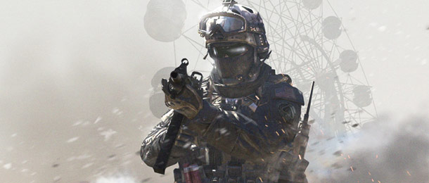
The photography is on point utilizing the imagery of soldiers and snipers brandishing their weapons of choice like they just stepped out of the game, and into real life. This is executed so well especially with the awesome soundtrack reprising in the background to add to the anticipation of what you are about to get into. Â I love the way that photos and screen shots are used throughout the game to enhance mood and stabilize the feel of immersion into this world created by great artists.


In conclusion you can see I love this game from a design and gaming aspect. I do give low points for the booklet however, but this game is addictive and very fun to play like its last two predecessors, World at War and Modern Warfare. I give kudos for not putting too much gore and unwanted profanity in a game played by kids that’s made for a mature audience. With all that said, I still think that it is game of the year as far as first person shooters go. What are your thoughts on this games presentation, I would love to hear some other opinions.
I Agree with basicly everything you said however they could have improved on alot of stuff if there were a public beta
Very nice in depth review of the design aspect of the game. I remembered when I first start playing the game I had some of the same reactions to the graphics, at first I thought it was too minimalistic, but after a few minutes of playing, I loved how the interface did not get in the way of playing, the team really put a lot of thought into the layout 🙂