Case Study of Elements of Time
Digital Art is something I fell in love with in the late 90’s. It’s one of those things that’s able to challenge my creativity no matter how much I have grown as a designer. I’m always trying to find new ways to put things together, and make them work. That’s why I’m always trying to add new things to my skill set.
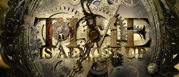
The purpose of this artwork was to bring forth the feeling of the end. That time is almost up, and the scripture used is a bread crumb to a trail to more evidence. I also wanted a Sci-Fi element to be involved so, I went for a palette of brown and yellow hues.
The primary fonts used in the main artwork are Georgia, and Times New Roman

I took a photo of the clock at my church with an Olympus Evolt E-510 for the main focal point of the artwork.

Then I got some stock photos of clock parts and an awesome scene for the background from photos.com


I saw an incredible break away effect that was on PSDtuts.com, but I wanted a better execution so, I found this tutorial on Photoshop Masters and followed it.


I also used Adobe Illustrator to make some simple elements to add to the aesthetics of the theme.

After a few hours of trial and error and, many Photoshop techniques and brushes, I ended up with the final results.

I hope that you gained some insight into this creation that has surprisingly got me a lot of attention. If you have any words you would like to share regarding this piece, I would love to see them.
nice creation.
I like the entire “Elements of Time” piece. It puts everything into perspective, time is precious.